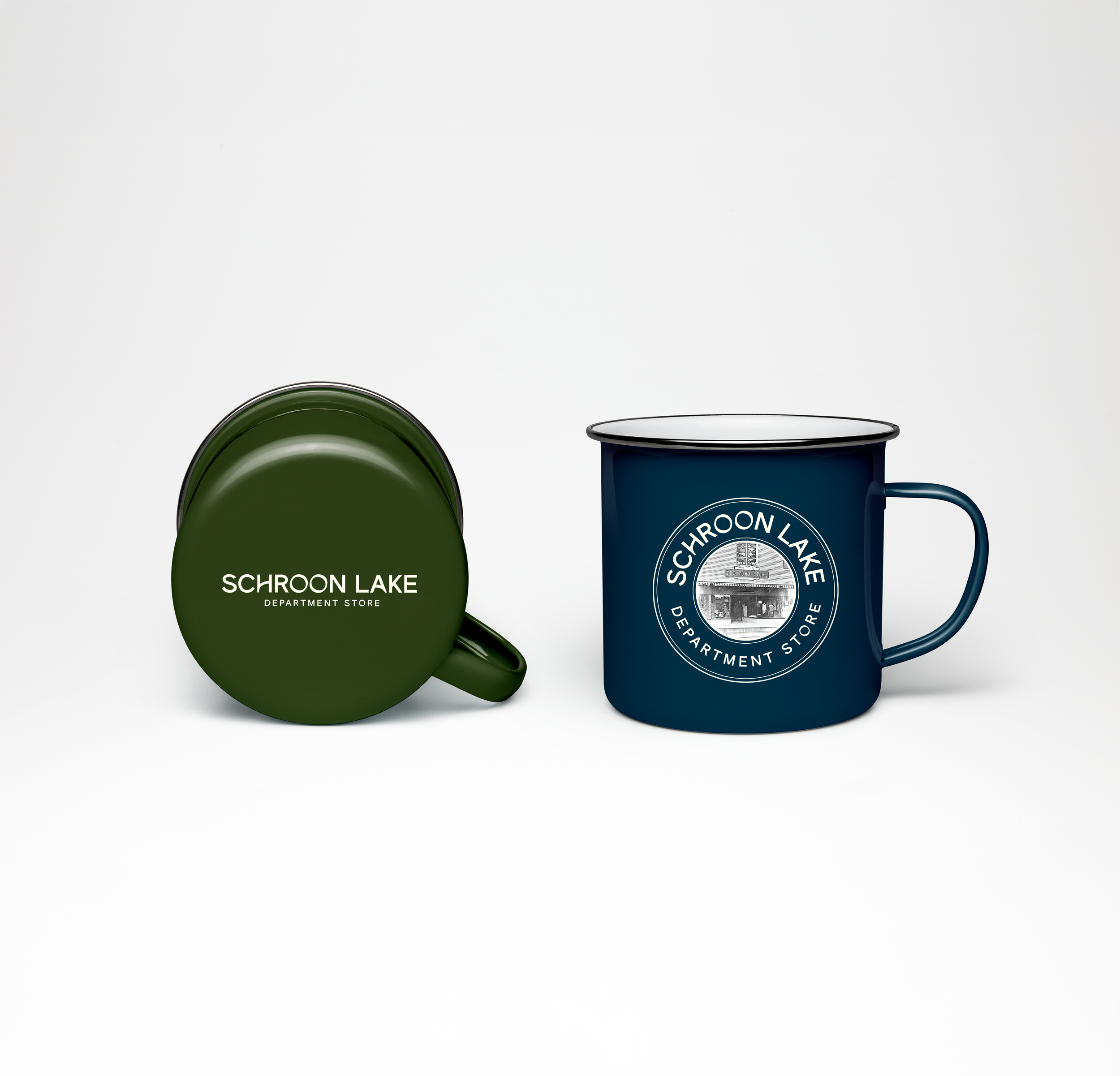
SCHROON LAKE DEPT. STORE
Brand Identity | Logo Design | Product Design
An established General Store located in The Adirondacks in Upstate New York recently became under new ownership–my dear friends Amanda and Ryan.
The new owners wanted to create a new brand identity. During many hours on the shop floor, as we set up for the reopening, we would brainstorm ideas of how to evolve the store.
I was studying for a postgrad Graphic Design course at Pratt Institute, NY last year and this rebrand became the perfect brief for my Graphic Design Brand Campaign project.
The store is a much loved establishment of the local town, Schroon Lake, and it’s community. Located in a vacation hot spot close to Lake George, generations of families have visited this store for the past 100 years. It was really important the new branding respected the history and nostalgia of the store whilst refining and repositioning it as a brand for the future.
After digging into the history books it was discovered the store was originally called Schroon Lake Department Store, which was more fitting than the name they acquired the store under– The Towne Store. As part of the rebranding the name was changed.
For the new logos and typeface I was inspired by the old stained glass windows that were uncovered during the renovation and looked at brands such as the Tin Building and Liberty of London for their use of typefaces in a system. The brand values and tone of voice were inspired by the local environment and community needs.
After sharing my campaign to the new owners, they loved it and adopted it. I am very proud to share it is now the new branding for Schroon Lake Dept. Store!


